The Hidden Revenue Stream: How Gift Cards and Add-Ons Boost Your Bottom Line
The Overlooked Opportunity Most studio owners spend their energy filling classes and booking appointments. That’s the core revenue, so it makes...

Your website is the online hub of your business, so it’s in your best interest to design it to be as user-friendly and intuitive as possible. When your site is well designed, it functions both as an informational and transactional resource for your members, and as a marketing tool to help you gain new clients at your gym.
Here are a few website design best practices for the fitness industry:
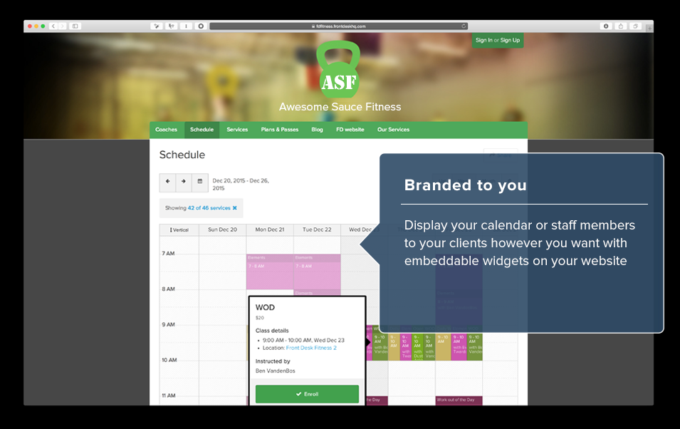
Your aim is to make your website as user-friendly as possible by offering the most important information on the homepage. For a gym or fitness studio, the critical info is your schedule and your location. Members visit your website to browse and book classes; prospects are looking for a convenient location and quality class offerings as they choose a new gym.
Data suggests that most users will leave a website in less than 10 seconds if the content isn’t useful or entertaining. So make sure your most important information can be found in that timeframe.
These days members don’t join a gym just for the workouts. They are also looking for a sense of community that helps them feel motivated and supported. The About Us section of your website is the perfect place to introduce your team and showcase your gym’s values. A prospect who is considering joining your gym will absolutely visit this section of your site. Be authentic–you want the prospect to get a real sense of who you are and what your story is.
People respond to photos, so showing off your staff, your facility and your community is a good way to connect with potential members. Photos tell stories that help people connect with your community before they ever step foot in your facility.

Social proof is the most powerful form of marketing and you’ll want to feature your happiest clients. People inherently trust client testimonials and will often make decisions based on them. Client reviews are especially helpful for advertising a new class or boosting attendance in one that’s been struggling. You can gather reviews by regularly surveying your clients and asking for feedback.
If you have any ongoing sales or promotions, highlight them on the homepage of your site. This is for the same reason that you put your schedule front and center: it’s information that your members or prospects absolutely want to know. If a promotion catches their eye, you might be able to keep them on your site past that 10-second mark, making it much more likely that they’ll make a purchase.
Keep your website manageable
How to design a website for your gym is important and deserves attention, but don’t take on anything you don’t have time to manage properly. This may mean foregoing a blog or not concerning yourself with linking social media channels. If you don’t have the resources to do it well, it’s better–and a lot less stressful–to just not worry about it.
One way to easily manage your website is to outsource. Pike13 partner 97Display offers hands-off, high-quality websites for the fitness industry. They’ll take care of the design and any updates and optimize for SEO. Your class schedule is easily embeddable and is linked to your Pike13 site so you only have to worry about making updates in one place. With 97Display handling your website, you’ll have more time to focus on your clients.
Running a Business is Hard—We Make It Easier.
Find expert tips, advice, inspiration, and success stories below. One click and you might binge-read our best insights!

The Overlooked Opportunity Most studio owners spend their energy filling classes and booking appointments. That’s the core revenue, so it makes...

Protect your business and client data from unauthorized access with multi-factor authentication—a critical security layer that goes beyond passwords...

Whether you run a fitness studio, yoga center, or any other membership-based business, managing registrations, payments, and customer data can be...

Pike13 makes it super easy to add a "Enroll" button to your website that links to your online Booking Page. Whether you have direct access to your...

The hard part is done. You’ve built a website that shares your vision. Now you need to give your website visitors the option to take action they want...

With the recent redesign of the Pike13 website, I've been thinking a lot about website content. Sites are tricky things. Business owners have a...