

The Hidden Revenue Stream: How Gift Cards and Add-Ons Boost Your Bottom Line
The Overlooked Opportunity Most studio owners spend their energy filling classes and booking appointments. That’s the core revenue, so it makes...
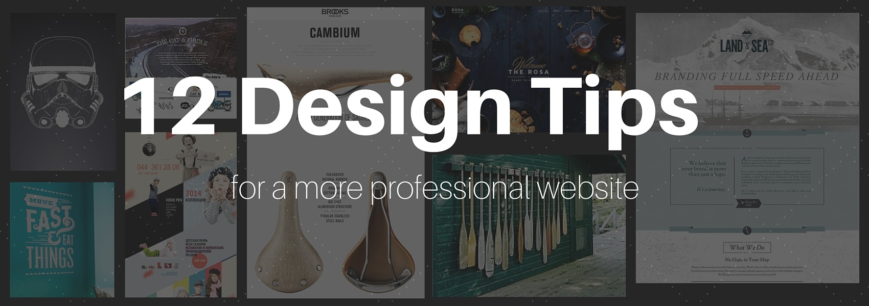

In today's world, a business website is mandatory. Many owners throw something together in a jiffy just to have an online presence. That’s a step in the right direction, but you want a website that will accurately represent your brand and leave an impact. You need to focus on the design.
As a business owner, you take on a tremendous variety of roles and responsibilities. In the beginning, you’re not only the CEO, but also the sales team, IT department, and marketing manager. All with little to no help. In your efforts to add ‘website design optimization’ to your resume, here are a few tips from our design experts at Pike13.
Here are 10 ways to optimize your website design for non-designers:
1. Match your color palette to your brand.
Choose a color palette that is consistent and complements the essence of your brand. For example, if you own a CrossFit box, using colors such as black and red help communicate strength and energy in your brand. On the other hand, if you own a dance studio for young girls, using soft pastels will evoke calming and relaxation emotions that may better align with your brand.
Choose two primary colors, a complementary color and an accent color for your brand palette. If you’re having trouble identifying a great color palette, check out Color Hunt, or Paletton to help you.

2. White space is your friend.
Many people unintentionally make the mistake cramming everything on one page. This creates a busy, cluttered, unprofessional looking page that’s difficult to read. Leverage the use of white space, or the portion of the page left unmarked, to declutter it. White space focuses eyes on the core message. Every element on the page should have a reason for being there. When utilized well, white space makes your call-to-action (CTA) more prominent, guides your viewers through the page, and gives your page a modern, sophisticated look. Make sure there’s adequate spacing between elements for balance.

3. Make important information BIG!
The most important part of your message should be the largest and most visually dominant elements on your page. Use scale to illustrate the importance of the content on your site. Use complimentary colors on your color palette to help enhance this technique.

4. Never use more than three fonts.
Keep typefaces to a minimum. The rule of thumb is to use three or fewer fonts. In fact, some many experts even suggest maxing out at two fonts. Also, make sure the fonts you choose don't clash with each other. If you’re looking to get a dramatic effect, try using light, bold, condensed, and italic variants from the same font family rather than introducing a second or third font. This helps you to highlight certain elements while preserving uniformity.

5. Adopt fonts that are supported by all browsers.
You want all of your potential customers to be able to read your website. Many fonts aren’t supported by all browsers, so check out safe web font lists from MIT and WebDesignDev.

6. Skip the comic sans.
Are you wondering, “why not?” If you are, read “Comic Sans Criminal; helping people like you use comic sans appropriately.” Unless you’re running a business for kids and you have an announcement FOR kids, skip it.

7. Use contrast.
Contrast is a key component in establishing mood, clarity, and pop. Photo filters are one tool for enhancing the image. For optimum contrast, use light font on darker background colors/images and darker font on light background colors/images. Play with layering, filters, and color combinations to achieve high contrast.

8. Use a grid.
Using a grid to lay out your elements (especially your images) makes a design look more professional, crisp, and clean. You want to make sure your elements are consistently aligned, have enough eye-grabbing contrast and a nice balance of space between elements. Experiment with frames, symmetry (vertical and horizontal lines that correspond with other elements) and alignment to find the look you’re going for.

9. Use free high quality stock images.
The internet has a plethora of free stock images, so use them! Secondly, make sure they’re high quality images. The last thing you want on your professional website is a pixilated image. Check out unsplash.com and subscribe for 10 free high quality images every 10 days, or Canva for over 73 different sources.

10. Test your page load time and optimize it.
Ever been on a website that takes forever to load? What do you do? You leave. So design for optimal page load time. To increase conversion rate and ensure that your potential customers read your message, you want your webpage to load as fast as possible. Use a website speed test tool to enter your URL for a reading on how long it takes for your page to load.

11. Label your Navigation Icons.
When your visitors find out online, they’ll want to navigate from page to page. Be sure to label your navigation icons. Images are great for navigation icons, but without text explaining what they do, they can be unclear. In fact, label anything you want your visitors to click on including navigation icons, call-to-action (CTA) buttons and other links. Lastly, make sure you’re consistently keeping navigation icons in the same place on each page so they’re easy to find.

12. Pro Tip: Never stare at a blank page in search of inspiration.
When you're experiencing ‘designer’s block’, refrain from staring at a blank page or generic copy. It’s a recipe for getting nowhere, fast. Get your creative cylinders firing by putting your content on the page first and then design around the content. This gives you a starting point that’s easier to work from.
There’s no reason to recreate the wheel. If you’re still experiencing ingenuity trouble, try creating an inspiration board that includes designs, colors, images, and other visual elements that you feel represent the general design you want your page to embody. Visit a few inspiration websites to get your juices flowing like Designspiration.

There’s a lot to consider when designing a website. These twelve tips should get you on the right foot in learning the skills, tools and best practices for designing a killer website! Good luck!
Share your favorite design best practices with us in the comments section below!

The Overlooked Opportunity Most studio owners spend their energy filling classes and booking appointments. That’s the core revenue, so it makes...

Protect your business and client data from unauthorized access with multi-factor authentication—a critical security layer that goes beyond passwords...

Whether you run a fitness studio, yoga center, or any other membership-based business, managing registrations, payments, and customer data can be...

Your website is the online hub of your business, so it’s in your best interest to design it to be as user-friendly and intuitive as possible. When...

If you want people to find your business through online search engines, you’ll need to focus on improving your website’s SEO, or search engine o...

Pike13 makes it super easy to add a "Enroll" button to your website that links to your online Booking Page. Whether you have direct access to your...